Disney Parks Annual Passholder Experience

Project Overview

Create an exclusive web and mobile experience for Disney’s most valuable guests: Annual Passholders. To do so I had to lead a team of designers toward the goal of making a complex and expensive purchase easy and rewarding. During this project, my team had to create a digital solution that based on the actual the needs of Guests.

Project Type: Web & Mobile app
Industry: Entertainment & Travel

My Role

• Principal UX Strategist
• Principal UX Lead
• Team Lead & Mentor

What I Did

• Personas
• Experience mapping
• UX Strategy
• Wireframes
• Prototyping
• Usability testing

Research

UNDERSTANDING THE USER & CREATING EMPATHY
Personas

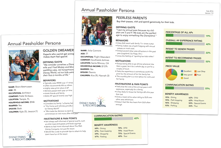
For this project, I was fortunate enough to partner with the Disney Consumer Insights team in order to gather appropriate data on Annual Passholders. From that information, I created 12 different personas; six for Disneyland Guests, and six for Walt Disney World Guests. These Personas were then used to help make design decisions throughout the project.

Experience Mapping

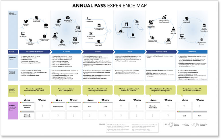
We felt strongly that we needed to better understand the myriad of touchpoints, actions, and emotions involved in the user’s experience so we decided to do something unconventional at Disney: create an Experience Map.
An Experience Map is a strategic tool for capturing and presenting key insights into the complex customer interactions that occur across experiences with a product or service.
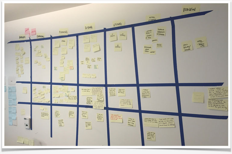
Using over 10 different sources of data I lead the UX team in an Experience Mapping exercise. We needed to know what the Guests were doing, thinking, and feeling during the entire experience. We then mapped out the experience from the “awareness” phase to the “renewal” phase. In all, we used over 100 datapoints to map out the user’s experience.

The Experience Map

This Experience Map represents the first time the Annual Passholder experience had ever been illustrated in a clear and actionable way. We used it throughout this project and beyond to give everyone an “outside-in” view into the lives of our Annual Passholders. It also gives very clear insight as to what areas of an experience need the most improvements.

The design team, product team, and senior management all found this to be immeasurably beneficial to help guide the direction of our work. Experience Mapping has since become a standard procedure at Disney.

UX Workshop

USING DESIGN THINKING TO UNCOVER INSIGHTS

Problem Statements

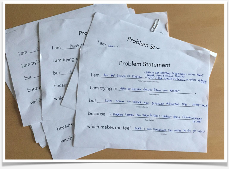
A Problem Statement is a brief description created using the user’s point of view that articulates the problems the team trying to solve for. Writing Problem Statements at the outset of a project is a great way to generate user empathy and to gain a shared vision among stakeholders.

Based on our Personas and the data in the Experience Map, we developed these Guest Problem Statements.
Audience Quadrants

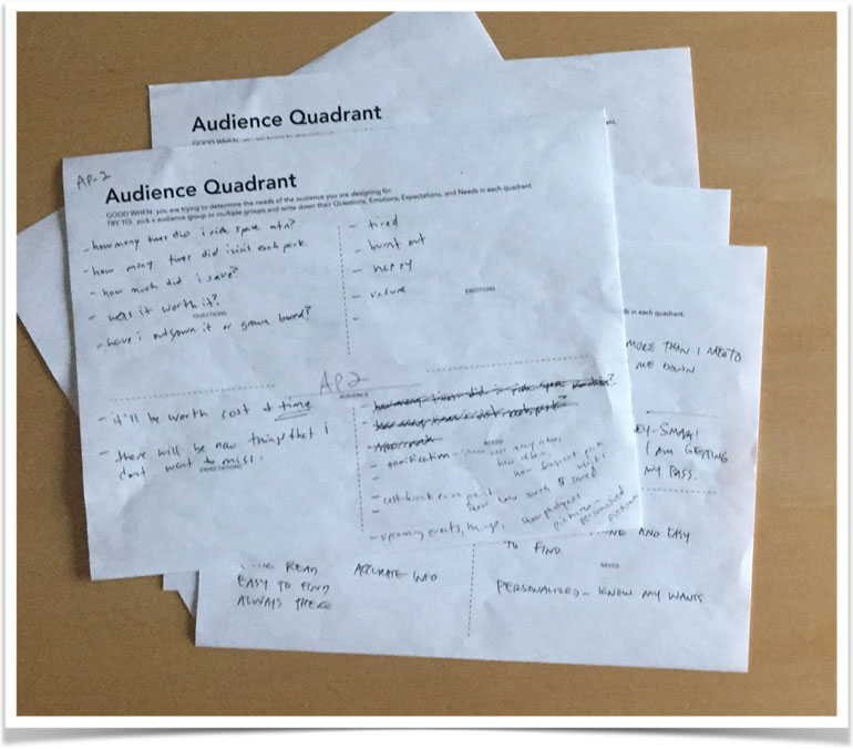
A Guest Quadrant is a way to understand Guest’s needs by surfacing and communicating their questions, emotions, expectations, and needs. Similar to Personas, a Guest Quadrant helps us achieve Guest empathy by understanding their motivations and emotional blockers.
Based on our Personas and the data in the Experience Map, we developed several Audience Quadrant documents that helped us uncover new factors in the overall experience.

Scenario Quadrants

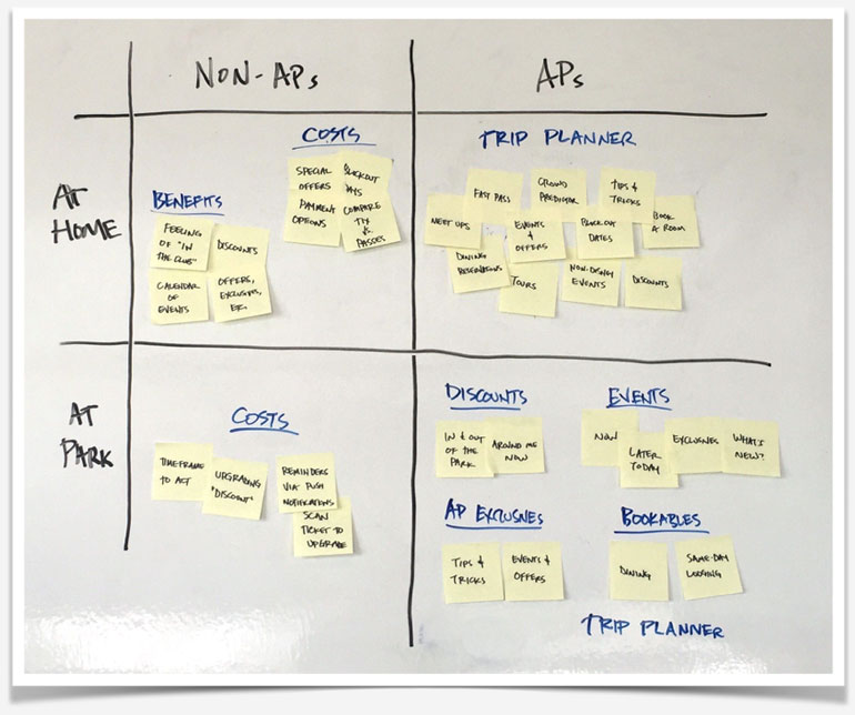
During our research, we realized that we have two Guest types (Annual Passholder and non-Annual Passholders) who were each in two different modes or locations (at the park and at home between visits). To help us better understand the needs for each combination we laid it out in a 2×2 grid and assigned the different needs in each quadrant. This allowed us to then brainstorm solutions for each need based on the user type and where they were in the experience.

Wireframes

COMPOSING SOLUTIONS THAT DELIGHT THE USER
Website Wireframes

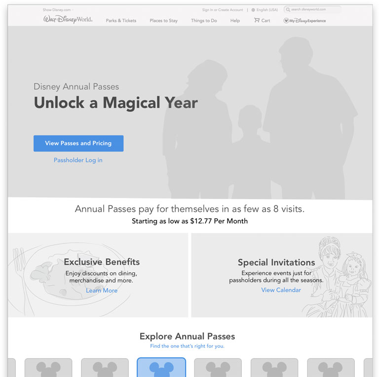
We developed three guiding principles for this project: 1) We needed to create a “velvet rope” experience to elevate the message to match user expectations; 2) We understood that people buy based on emotion and justify with logic and we wanted to support both in our designs; and, 3) We wanted the website and app to act as a “digital cast member” (aka employee) since they are world-renowned for their customer service.

To that end, we used large imagery that evoked storytelling to generate an emotional connection with our users. We also used value attribution by discussing costs upfront to appeal to their logical side as well. Finally, we embedded a curated social wall from Instagram to provide a bit of social proof.

Together, these features were put in place based exclusively on the user research we did at the onset of this project as way to meet their needs and expectations.

App Wireframes

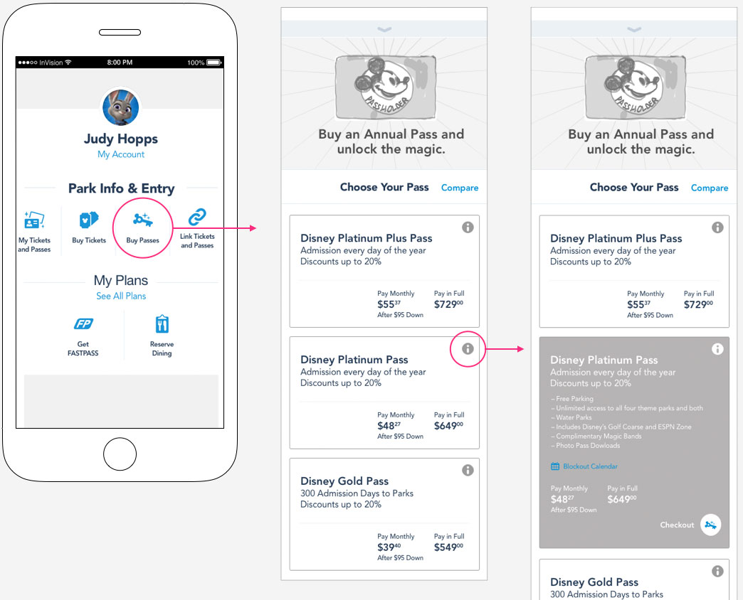
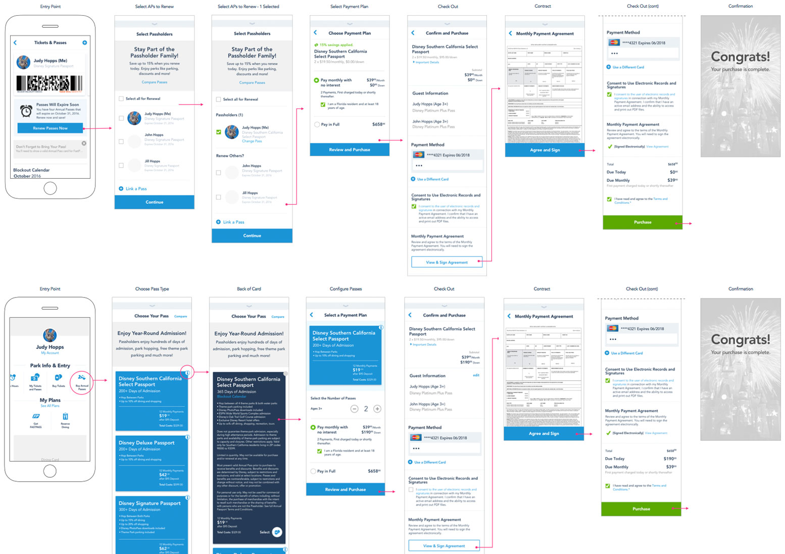
We also created similar wireframes for the Disneyland mobile app as well as the Walt Disney World mobile app.

Next, we created high-fidelity prototypes of both apps that we could use in testing our ideas. While both apps shared much of the same content, they were both unique to each park and the park guests.
Additional Wireframes
User Testing

GETTING FEEDBACK FROM THE USER
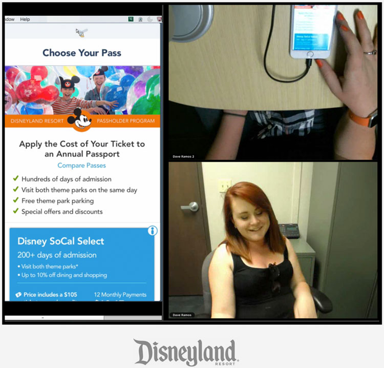
Guest Testing at Disneyland

Since designs mean nothing if the actual users don’t find them useful and appealing, we wanted to get our ideas in front of actual Disney Annual Passholders to test our ideas. To do that, we spent a few days at Disneyland where we could recruit actual Disney Annual Passholders who were visiting the park. We set up a makeshift usability lab in an area that Disney calls “backstage” where we could sit Guests down with our prototype to get their feedback.

In all, we had about 10 guests run through our prototype over a couple of days. Our moderator asked participants to perform tasks such as renew their current passes and buy additional passes. The moderator then probed for additional information so that we could fully understand their thoughts and opinions of our prototype.

When we were done collecting feedback, we had what we needed to make the necessary changes to the designs and screen flows.

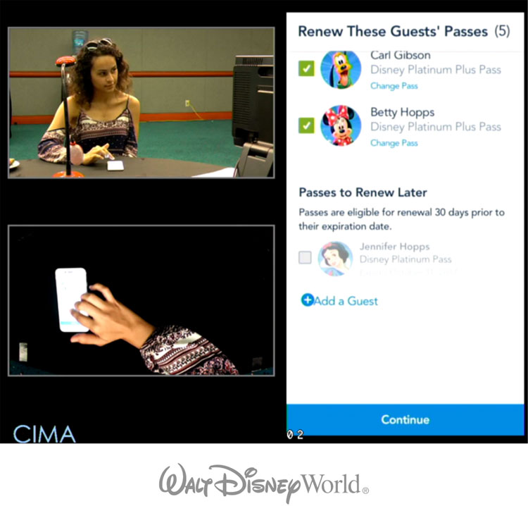
Guest Testing at Walt Disney World

After we made some improvements to our prototype, we set out for Walt Disney World in Orlando and recruited several more Guests to test our prototype. During both tests, we made sure to select a wide range of participants: long-time Annual Passholders, more recent Annual Passholders, some that were more tech savvy and some that weren’t as tech savvy.

We continued to test until we felt we covered all of our bases and had the feedback we needed. Once we were done we headed back to the office and made updates and changes to our designs based on all of the information we had discovered.
Visual Design

BRINGING THE DESIGNS TO LIFE
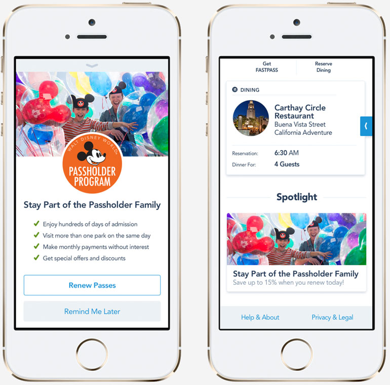
The Final Product

In the end, Disney Annual Passholders had something that not only met their needs and expectations, it was also an experience filled with the level of magic and delight they have come to expect from the Disney brand.

By creating empathy for our Guests, we were better able to co-create something that they would want to use with each visit to the park, and even the times between visits. Because the entire experience was designed based on actual Guest feedback we not only created a great web and mobile app, it also created a better connection to the brand for our Guests.
See More Work

Let’s Work Together

LET ME KNOW HOW I CAN HELP

If you’re looking for advice on your next big idea or you are looking for a seasoned design leader to add to your team, send me note. I am always on the lookout for my next challenge.